

Where to find your program analytics?
When viewing your Partner Program navigation, click on the Analytics page, in the Insights group: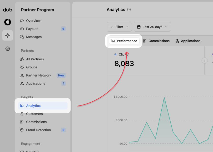
Program analytics views
Your program analytics dashboard consists of several views:1. Analytics chart
This is the default view and shows you the number of click events in a time-series chart over time. You can also select leads or sales to view their chart and data. Performance and Commissions data selector At the top of the analytics chart, you can switch between Performance and Commissions. Use Performance to analyze clicks, leads, sales, and conversion trends. Use Commissions to focus on commission earnings over time. For a deeper look at commission-specific reporting, see Commission analytics.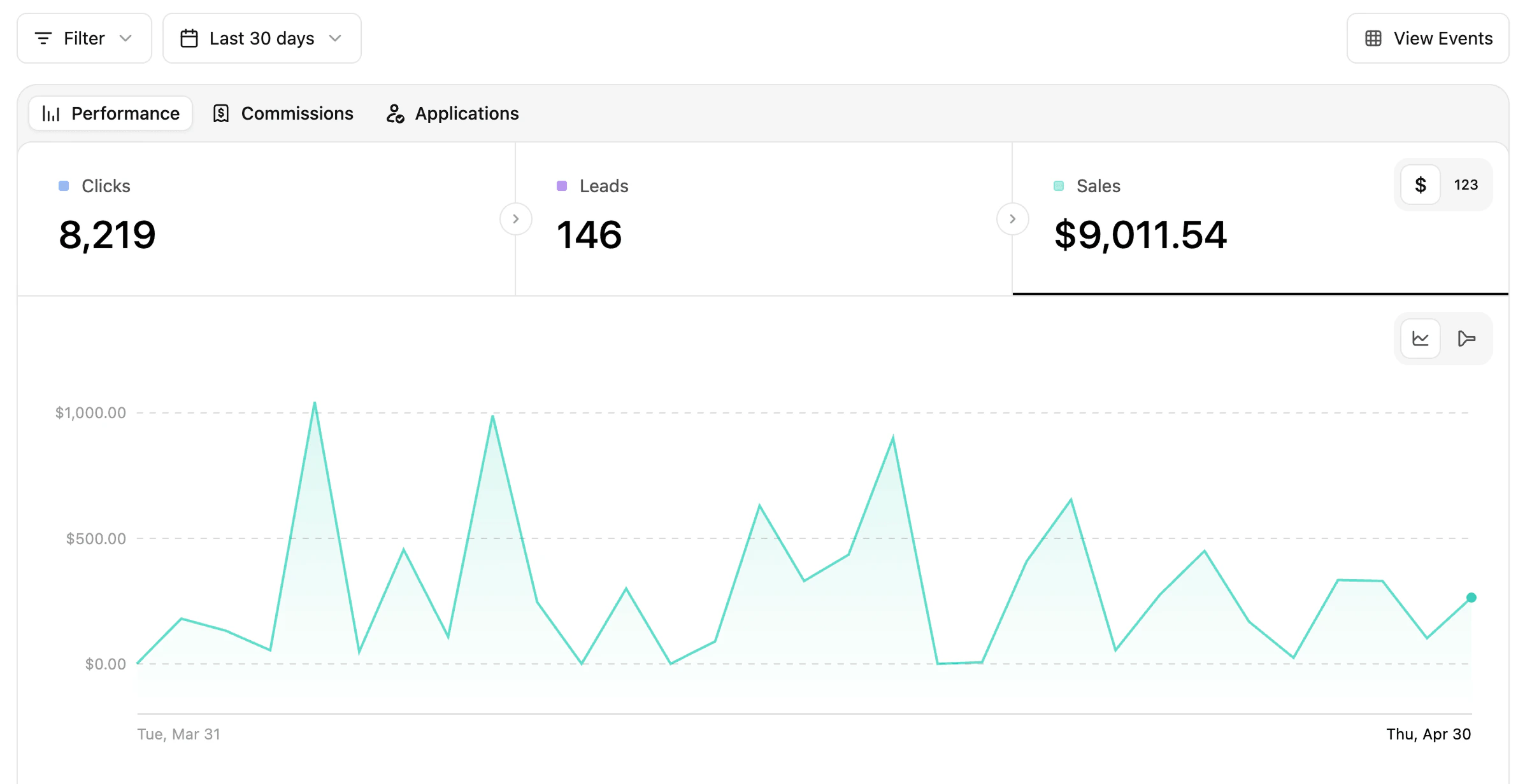
$ | 123 toggle in the top right of the data type section.
By default $ is selected, as it related directly to your reward types. Switching to 123 will change any monetary values to their specific reward count. If your program has other monetary rewards (clicks, leads, sales), their dollar amount will show as well.

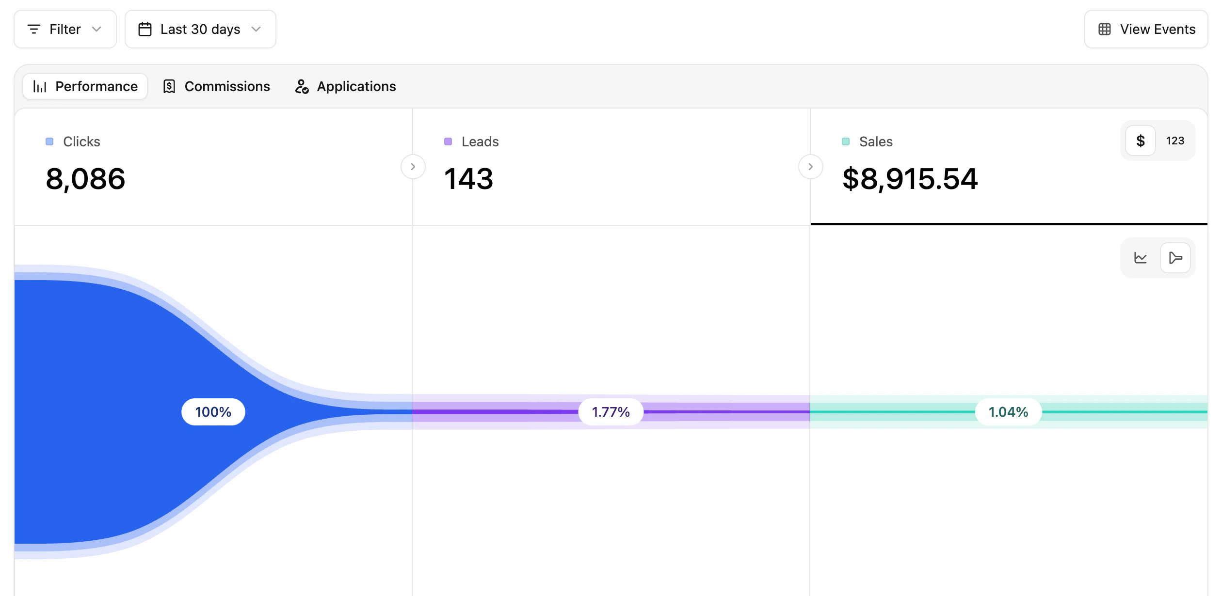
time-chart | conversion funnel toggle in the top right of the chart area.

2. Partner data table
This table shows your partners performance for each of the data types from the time-series chart (clicks, leads, and sales). The matching data column is sorted by most-to-least, so you can quickly see who is the top performer for that category.
3. Aggregated data for different facets (top views)
These are more commonly known as the “Top Views” in Dub Analytics. These views show your top links, countries, cities, devices, and more.
- Links - Short Links and Destination URLs
- Referrals - Referrers and UTM Parameters
- Location - Countries, Cities, Regions, and Continents
- Tech - Devices, Browser, OS, and Triggers
Filtering your data
With all this data, it’s important to be able to filter and make better decisions. You can click the Filter button in the top left will show you the options available.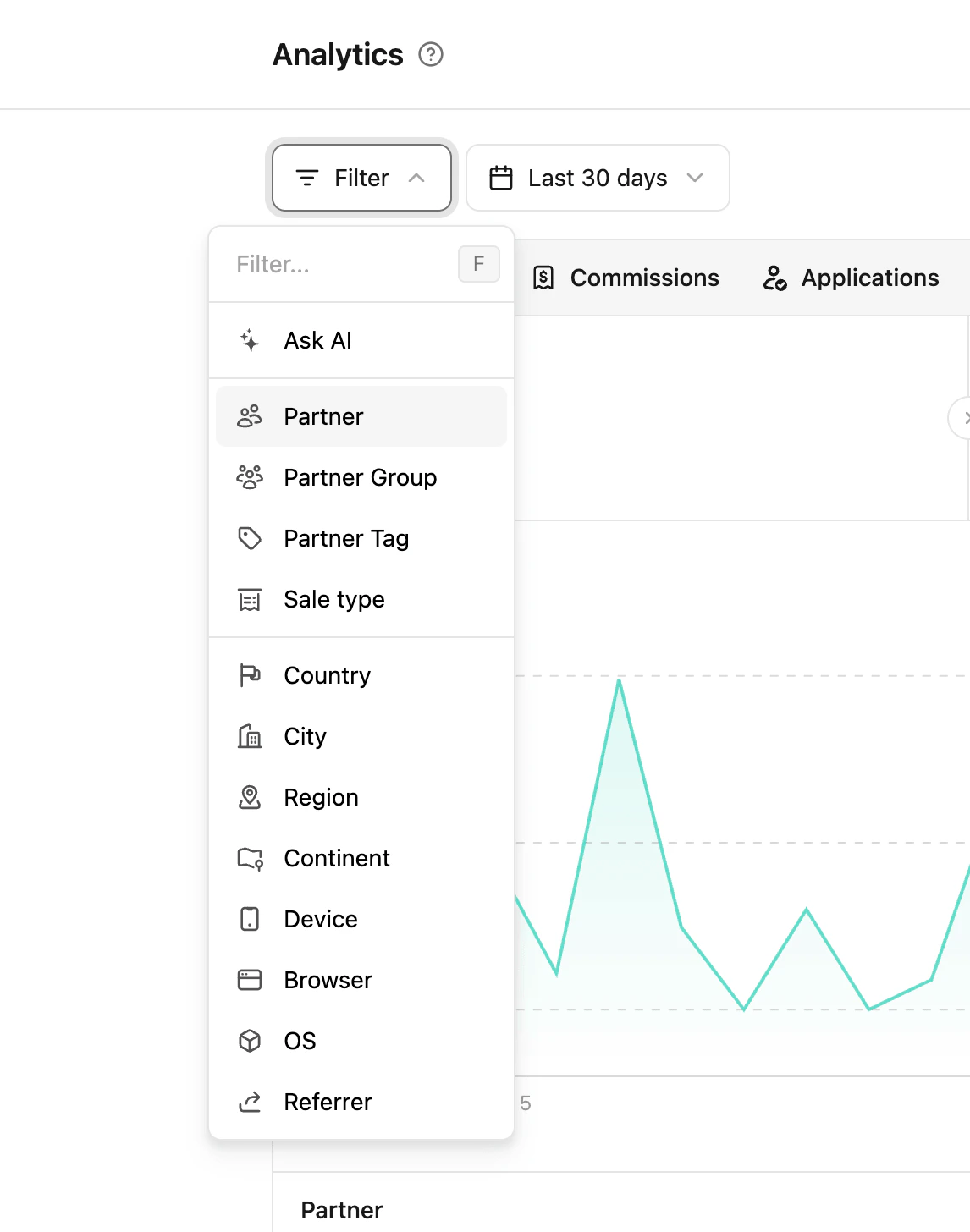
| Filter | Description |
|---|---|
| Ask AI | Use natural language to query your analytics - eg: “mobile chrome users US only”, “UK android users” |
| Group | Select a specific partner group |
| Tag | Select a specific partner tag |
| Partner | Select a specific program partner |
| Country | Select a specific county |
| City | Select a specific city |
| Continent | Select a specific continent - N. America, Europe, etc |
| Device | Select a specific device - Desktop, Mobile, Tablet, etc |
| Browser | Select a specific browser - Chrome, Safari, Firefox, etc |
| OS | Select a specific operating system - Windows, Mac OS, etc |
| Referer | Select the specific website a visitor arrived from |