{cta}
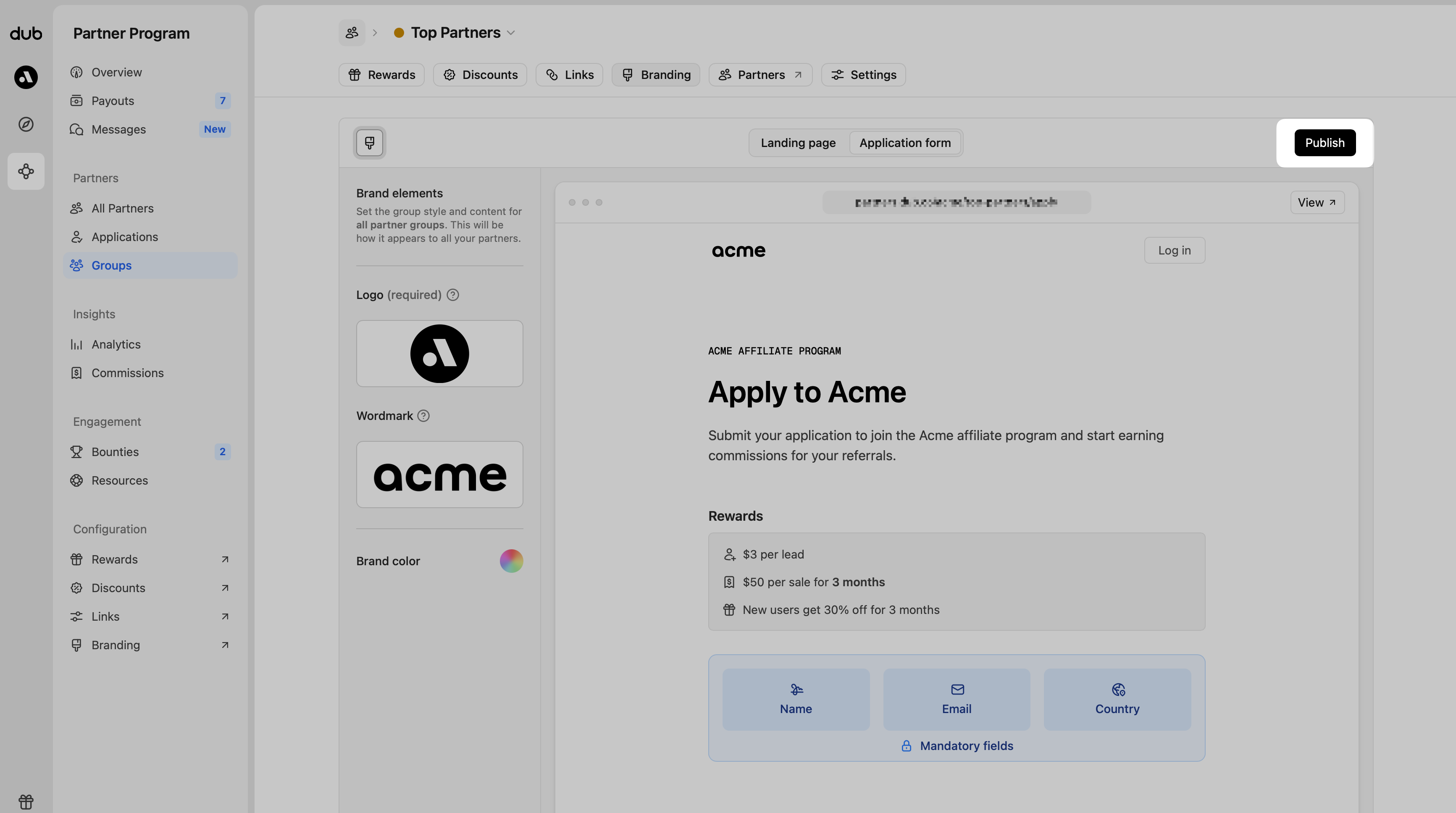
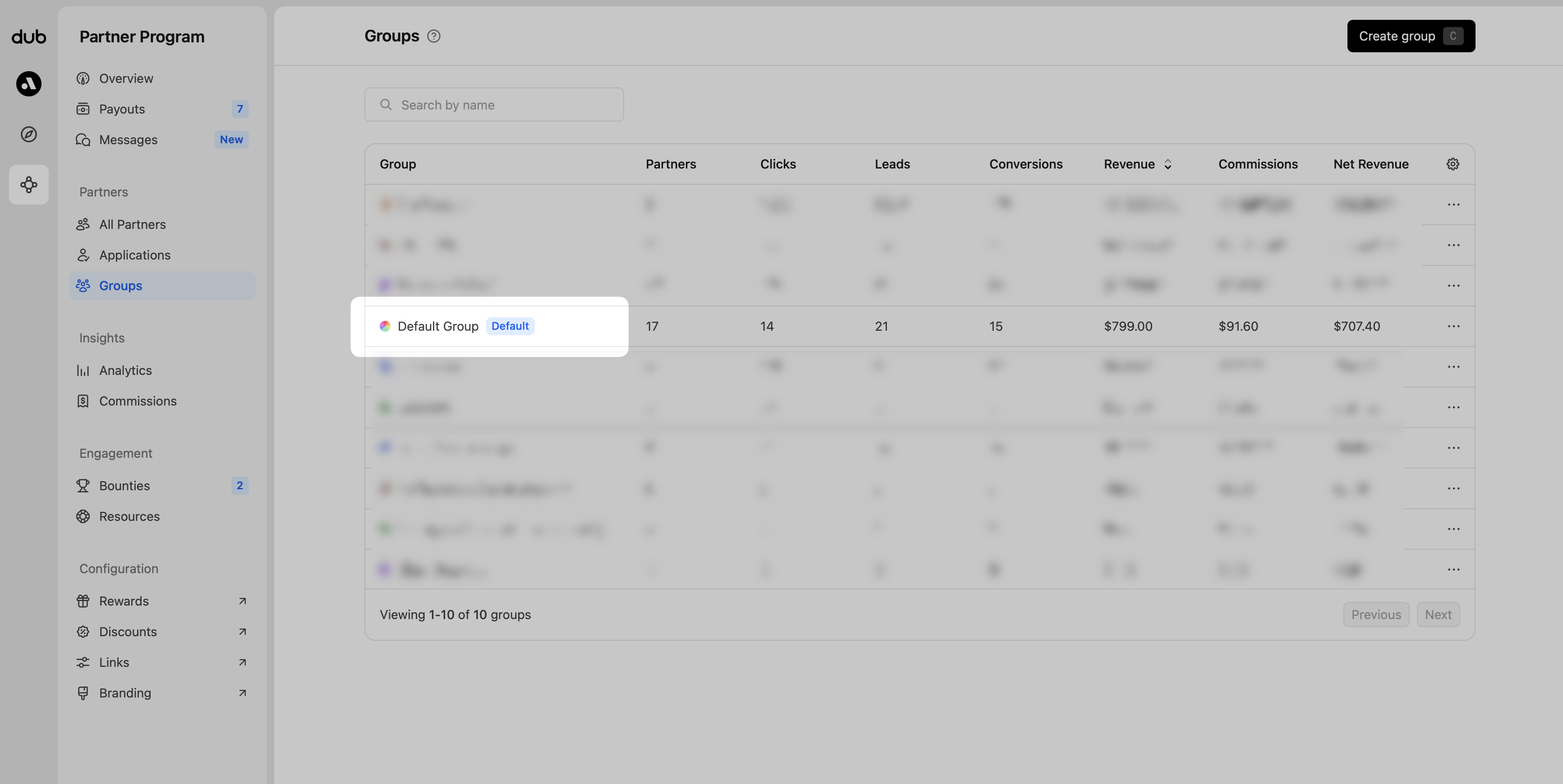 From the tab navigation, click **Branding,** then in the content panel, choose **Application form** to open the editor.
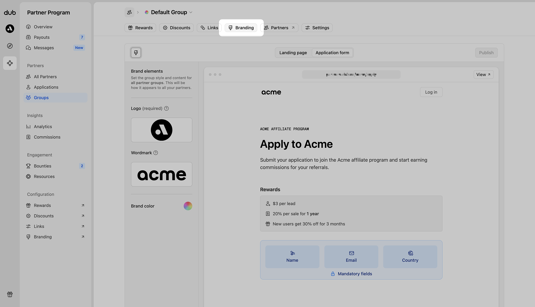 For your convenience, [here's a quick link](https://app.dub.co/program/groups/default/branding?tab=application) that brings you directly to the application form builder for your program's default group.
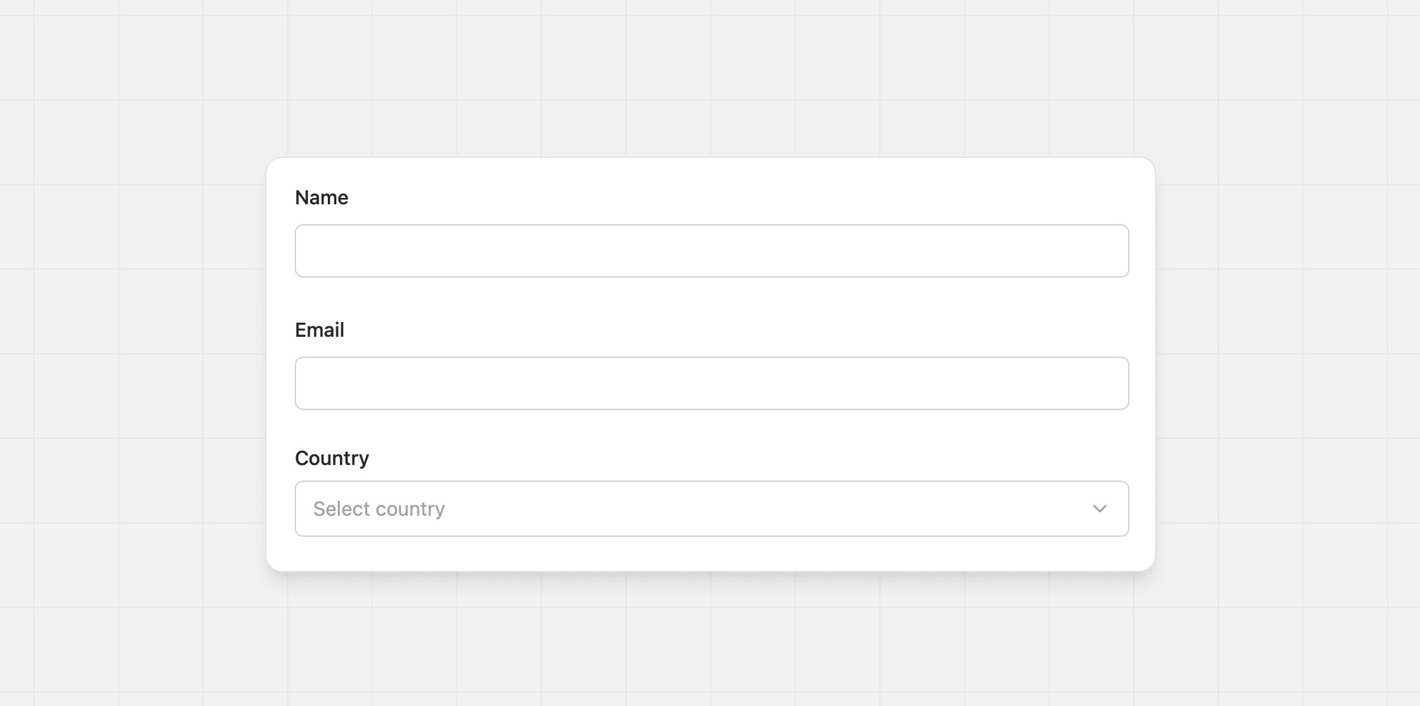
## Mandatory fields
Name, email, and country are always required and appear at the top of every form. You cannot remove or rename them.
For your convenience, [here's a quick link](https://app.dub.co/program/groups/default/branding?tab=application) that brings you directly to the application form builder for your program's default group.
## Mandatory fields
Name, email, and country are always required and appear at the top of every form. You cannot remove or rename them.
 ## Editing and adding fields
Hover over form content in the builder to reveal actions for adding, editing, deleting, and reordering fields. Content that appears above the form can only be edited. This keeps the page layout consistent for applicants.
## Editing and adding fields
Hover over form content in the builder to reveal actions for adding, editing, deleting, and reordering fields. Content that appears above the form can only be edited. This keeps the page layout consistent for applicants.
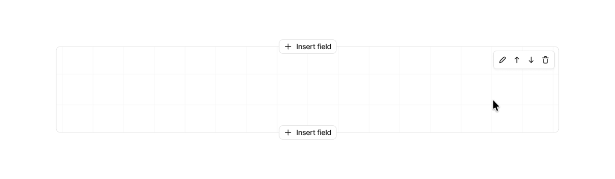 ## Input field types
Click **Insert field** to open the selector, then pick the input type you want to add.
## Input field types
Click **Insert field** to open the selector, then pick the input type you want to add.
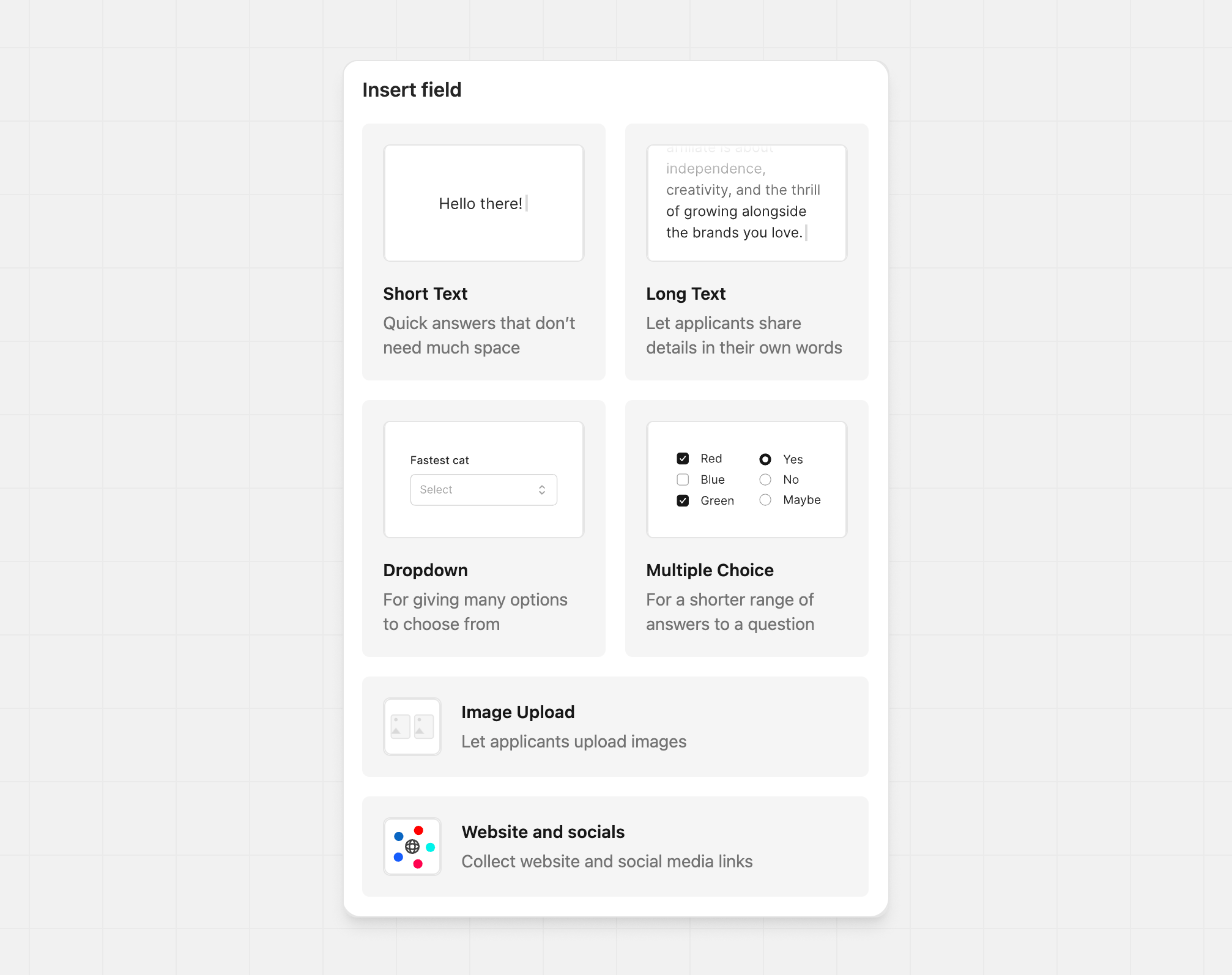 ### Short text
Use for short answers like names, one-line bios, or URLs.
### Short text
Use for short answers like names, one-line bios, or URLs.
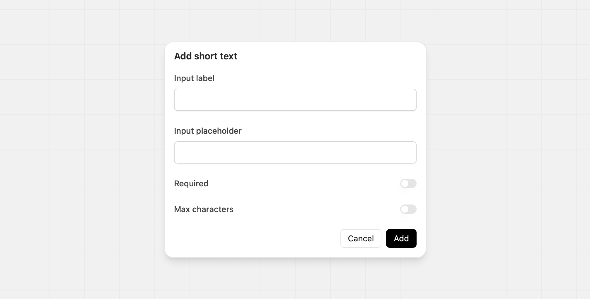 | Option | Details | Example |
| ----------------- | ------------------------------------- | ----------------------------------- |
| Input label | The text above the field | *"Link to your top social profile"* |
| Input placeholder | Guidance shown inside the empty field | *"x.com/steventey"* |
| Required | Make the field mandatory | Yes |
| Max characters | Set a character limit when needed | 120 |
### Long text
Use for longer responses that need multiple lines.
| Option | Details | Example |
| ----------------- | ------------------------------------- | ----------------------------------- |
| Input label | The text above the field | *"Link to your top social profile"* |
| Input placeholder | Guidance shown inside the empty field | *"x.com/steventey"* |
| Required | Make the field mandatory | Yes |
| Max characters | Set a character limit when needed | 120 |
### Long text
Use for longer responses that need multiple lines.
 | Option | Details | Example |
| ----------------- | ------------------------------------- | ----------------------------------------------------------- |
| Input label | The text above the field | "Tell us about your content strategy" |
| Input placeholder | Guidance shown inside the empty field | "Describe your approach to creating and sharing content..." |
| Required | Make the field mandatory | Yes |
| Max characters | Set a character limit when needed | 500 |
### Dropdown
Best when you have more than five options. You can add, reorder, and delete options at any time.
| Option | Details | Example |
| ----------------- | ------------------------------------- | ----------------------------------------------------------- |
| Input label | The text above the field | "Tell us about your content strategy" |
| Input placeholder | Guidance shown inside the empty field | "Describe your approach to creating and sharing content..." |
| Required | Make the field mandatory | Yes |
| Max characters | Set a character limit when needed | 500 |
### Dropdown
Best when you have more than five options. You can add, reorder, and delete options at any time.
 | Option | Details | Example |
| ------------------------- | ----------------------------------------- | ----------------------------------------------------------- |
| Input label | The text above the field | "Which platforms do you use?" |
| Required | Make this field mandatory | No |
| Allow multiple selections | Toggle this to allow more than one choice | Yes (for checkboxes) |
| Options | The choices the applicant sees | "Instagram", "TikTok", "YouTube", "LinkedIn", "X (Twitter)" |
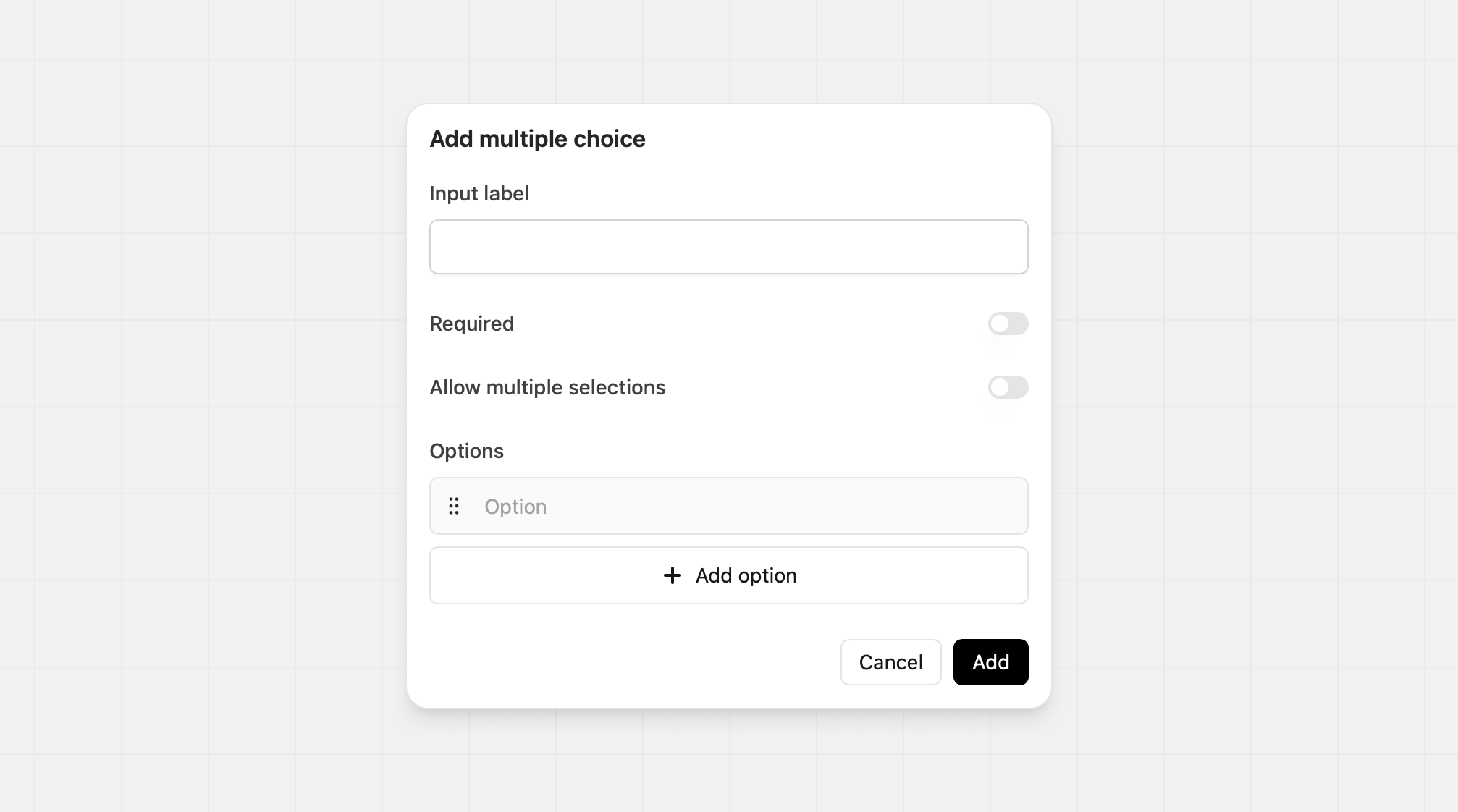
### Multiple choice
The multiple-choice input can serve multiple purposes:
1. **Radio** - A list of items that an applicant can select only one from
2. **Checkbox** - A list of items that an applicant can select one or many from
By default, the initial input is set to the radio option, but the input can adapt to your needs.
| Option | Details | Example |
| ------------------------- | ----------------------------------------- | ----------------------------------------------------------- |
| Input label | The text above the field | "Which platforms do you use?" |
| Required | Make this field mandatory | No |
| Allow multiple selections | Toggle this to allow more than one choice | Yes (for checkboxes) |
| Options | The choices the applicant sees | "Instagram", "TikTok", "YouTube", "LinkedIn", "X (Twitter)" |
### Multiple choice
The multiple-choice input can serve multiple purposes:
1. **Radio** - A list of items that an applicant can select only one from
2. **Checkbox** - A list of items that an applicant can select one or many from
By default, the initial input is set to the radio option, but the input can adapt to your needs.
 | Option | Details | Example |
| ----------- | ------------------------------ | ------------------------------------ |
| Input label | The text above the field | "What's your primary content focus?" |
| Required | Make the field mandatory | Yes |
| Options | The choices the applicant sees | "Tech & SaaS", "Business & Finance" |
### Image upload
Add an image field to your application so partners can share proof, examples, or supporting materials.
| Option | Details | Example |
| ----------- | ------------------------------ | ------------------------------------ |
| Input label | The text above the field | "What's your primary content focus?" |
| Required | Make the field mandatory | Yes |
| Options | The choices the applicant sees | "Tech & SaaS", "Business & Finance" |
### Image upload
Add an image field to your application so partners can share proof, examples, or supporting materials.
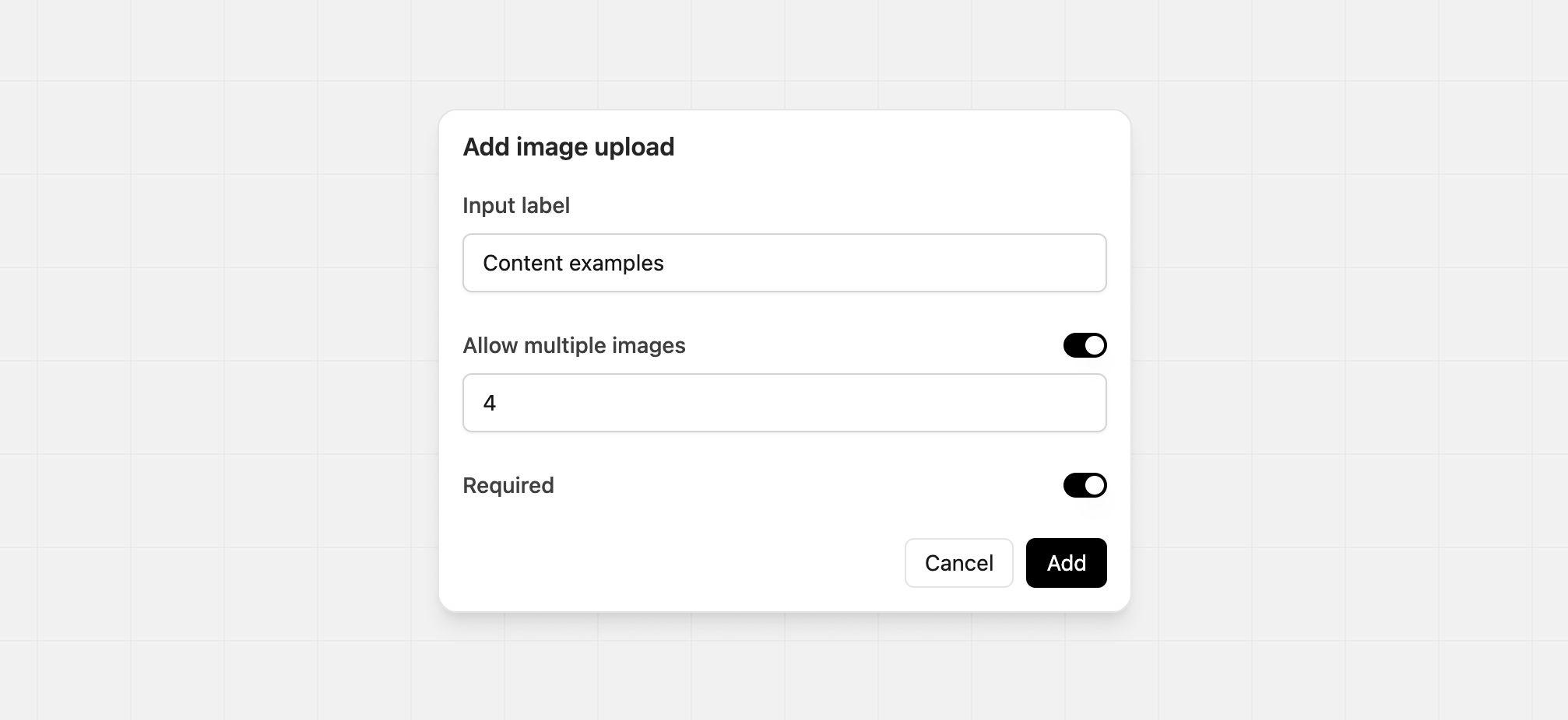 | Option | Details | Example |
| --------------------- | --------------------------------------------------------------------- | ----------------------- |
| Input label | The text above the field | "Analytics screenshots" |
| Allow multiple images | Enable partners to upload multiple images. Minimum 2, and maximum 10. | |
| Required | Make the field mandatory | |
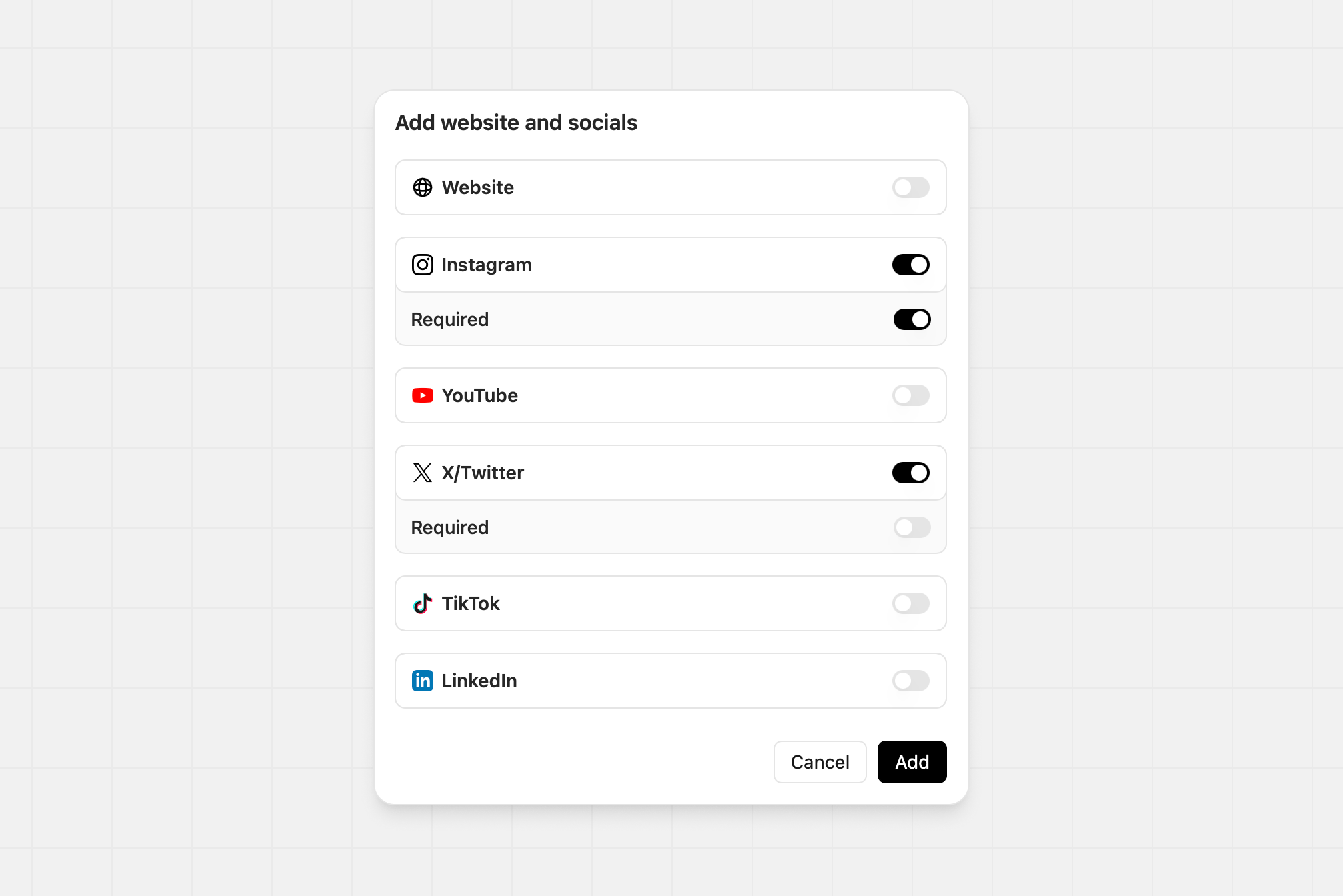
### Website and socials
Ask for specific website or social accounts. Toggle each network on or off and mark any required. For example, you might require Instagram but make X optional.
| Option | Details | Example |
| --------------------- | --------------------------------------------------------------------- | ----------------------- |
| Input label | The text above the field | "Analytics screenshots" |
| Allow multiple images | Enable partners to upload multiple images. Minimum 2, and maximum 10. | |
| Required | Make the field mandatory | |
### Website and socials
Ask for specific website or social accounts. Toggle each network on or off and mark any required. For example, you might require Instagram but make X optional.
 ##
##